MAKE FRENCH’S PROJECT
Project Scope
Design a mobile-ordering app for a French patisserie (Project prompt by Google UX Design Course)
Tools
– Figma
– Figjam
– Figjam
Role
UX/UI Designer (Research, Visual Design, Interaction Design, User Testing)
Duration
October 2022 – March 2023
PROJECT OVERVIEW
Project Background
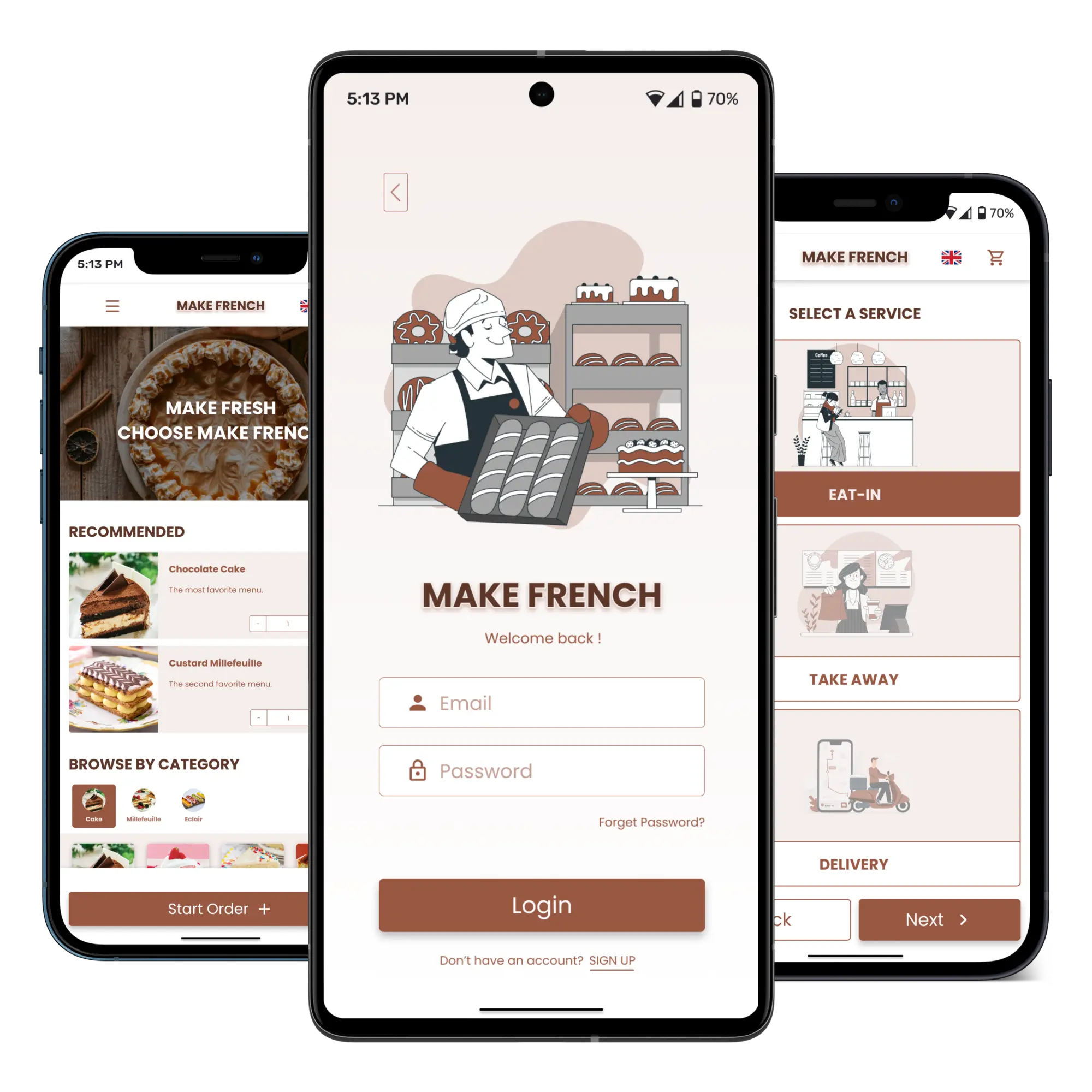
We’re creating a French patisserie app to help customers order and pickup one or more orders and also can reserve available seats for eat-in the shop and prepare orders for groups, so they can easier order and payment through the app.
Objectives
Design an easy way to use the mobile-ordering app to save more time to get in-store ordering.
Business Scenario
Business Name: Make French
Make French is a French patisserie with desserts and coffee. Their target customer is teenager and working age who like sweets and the atmosphere of a coffee shop. The store is located in the near BTS sky train station and MRT subway station of a metropolitan area.
Services:
– Make French’s offers in-store eating, delivery and pick-up service.
– Make French’s accepts orders from phone, online and walk-in.
DESIGN PROCESS

Empathize

Define

Ideate & Design

Prototype & Test
01. EMPATHIZE
Market Research
First of all, I started with market research to understand about meaning of patisserie shop because I’m not familiar with this type of café shop and also find out business insights that what products they sell, what services provide, who the customers are. After researched, I found that French patisserie sells about French pastries such as Millefeuilles, Macarons, Eclairs and etc. and the customers are student groups or people of working age who likes to eat French pastries or bakery or people who like to go to cafes.
Secondary Research
I have conducted a secondary research and created empathy maps to understand the users who order bakery and coffee from a French patisserie shop. A primary user group identified through research were exchange university students who have to spend their time for studying, taking exams and working on final project in university. A secondary user group was working people who usually meet their clients in some coffee shop and would like to reserve seats to eat-in the shop and also prepare food for their clients.
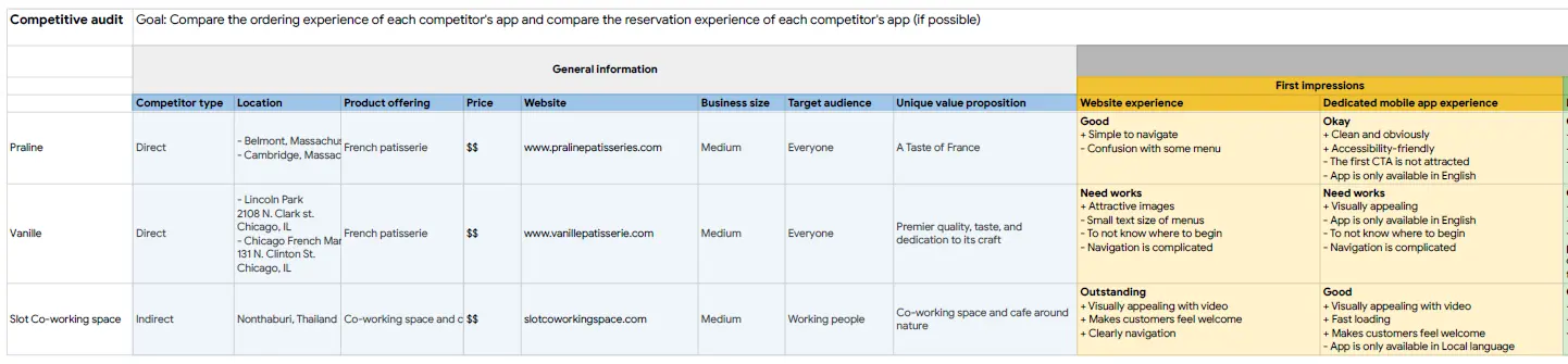
Competitive Audit
Competitive Goal(s) : Compare the ordering experience of each competitor’s app and compare the reservation experience of each competitor’s app (if possible)
Our direct competitors are Praline and Vanille, a French patisserie shop with online-ordering and delivery. Our indirect competitor is Slot Co-working space, a co-working space that includes a café and allows reservations to be made.
02. DEFINE
User pain points
After I did research studies and competitive audit I found 4 pain points.
01. Ordering process : In-app or website navigation is complicated.
02. Unappetizing images : Food images are not clearly. It feel unappetizing.
03. Menu Category : The food menu category is poorly laid out.
04. Translator : Don’t have in-app translator for worldwide users.
02. Unappetizing images : Food images are not clearly. It feel unappetizing.
03. Menu Category : The food menu category is poorly laid out.
04. Translator : Don’t have in-app translator for worldwide users.
Personas and Problem statement
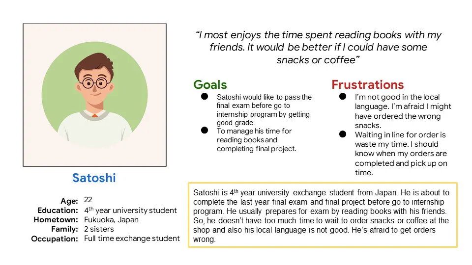
Problem statement:
Satoshi is a busy 4th-year university student from Japan
who needs easy-to-read and advance orders snacks or coffee because he has no time to wait in line and also his local language skills are not good.
Satoshi is a busy 4th-year university student from Japan
who needs easy-to-read and advance orders snacks or coffee because he has no time to wait in line and also his local language skills are not good.
Problem statement:
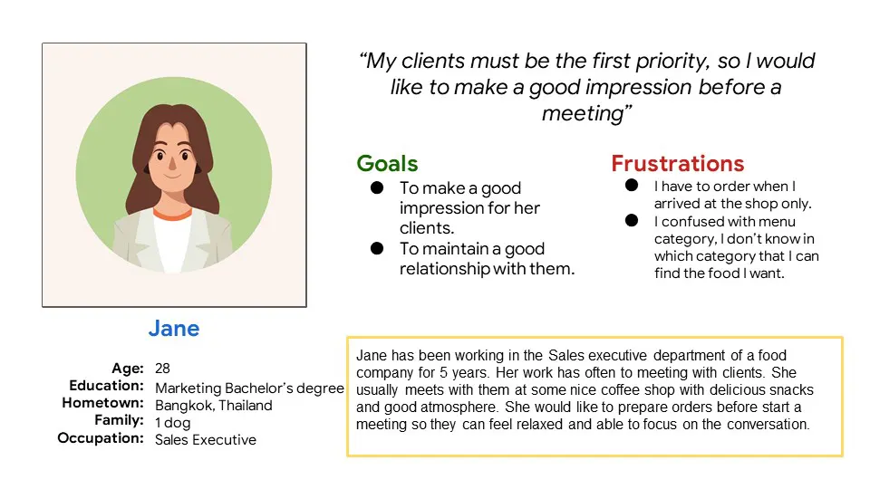
Jane is a sales executive who needs to find a nice coffee shop that can advance order delicious snacks and has a good atmosphere. She would like to prepare orders before starting a meeting so that she can make a good impression and maintain a good relationship with her clients.
Jane is a sales executive who needs to find a nice coffee shop that can advance order delicious snacks and has a good atmosphere. She would like to prepare orders before starting a meeting so that she can make a good impression and maintain a good relationship with her clients.
Personas and Problem statement

Satoshi’s Goal : Easy mobile-ordering app of French patisserie shop with translator.

Jane’s Goal : Find nice French patisserie shop with delicious snacks and can be able to prepare order for my clients.
03. IDEATE & DESIGN
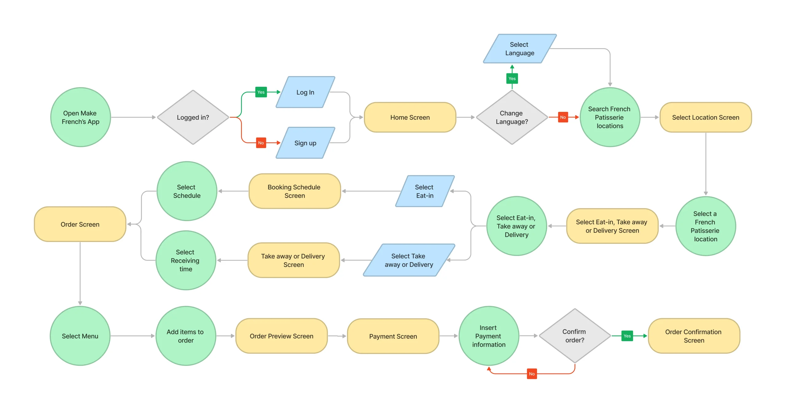
User Flow
User task : Use a French Patisserie’s app to easily order and payment bakery and coffee
I mapped user flows belong to the main user task to see the overall perspective of the user’s thoughts and actions through the app.
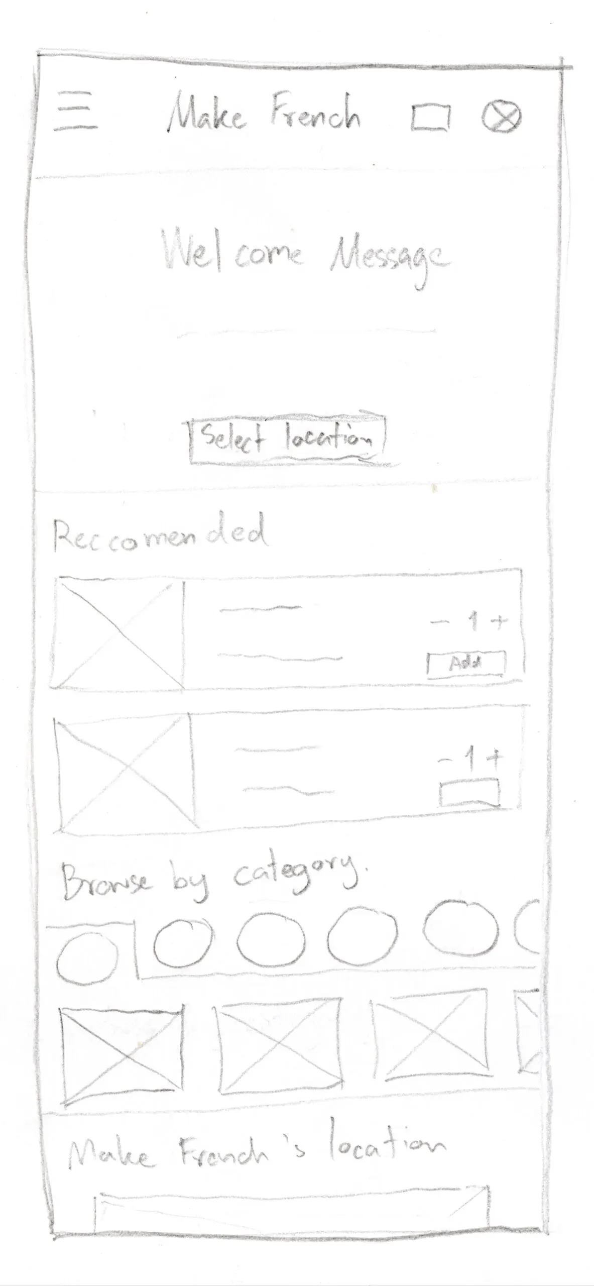
Paper Wireframes
After I created user flow on task, I started sketching 5 paper wireframes of home screen with different designs to quickly capture my ideas and marked the useful sections.


Paper Wireframes (Refined)
Based on the different designs created, I selected useful sections and incorporated them into a refined home screen.
Digital Wireframes
After paper wireframes were completed, I turned it to digital wireframes on Figma.
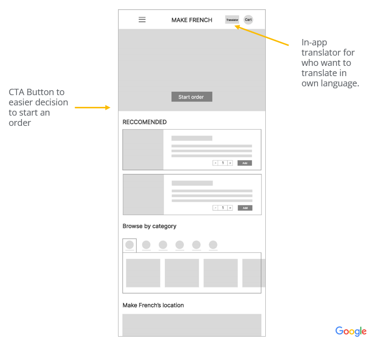
Make French’s initial home screen design based on the user research data.

I designed a menu page that organizes the product menus by category to make it easier to find what users are looking for.
04. PROTOTYPE & TEST
Low-fidelity Prototype
After creating paper wireframes and digital wireframes, I developed a low-fidelity prototype and added interactions and motion to make it look more realistic and visual. There is the main user flow involves users starting their order and completing it step-by-step.

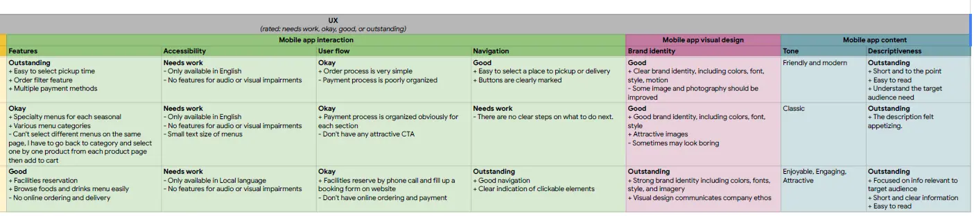
Usability Study
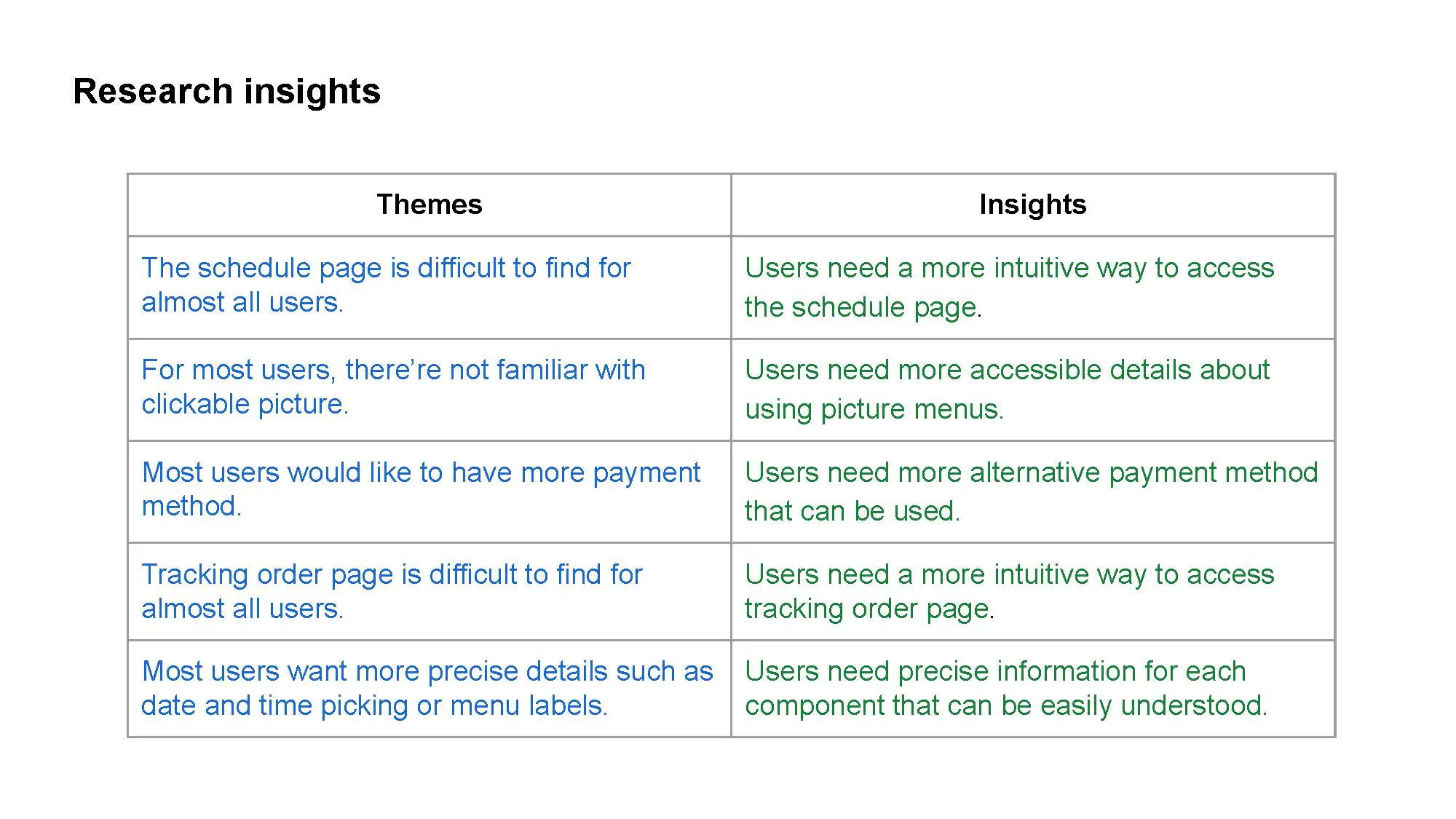
I wrote a UX Research study plan to test how difficult it is to order food from Make French via a mobile ordering app using a low-fidelity prototype. There were 5 participants who were working individuals and students who had experience ordering food online, which were 2 males, 3 females between the ages of 18 to 60 by unmoderated usability study method. I have conducted low-fidelity usability study and I found research themes and insights follow the table below.
Affinity Diagram
After conducting research, I wrote an Affinity Diagram based on observations and notes-taking on behavior during app usage to see which parts of the user experience problems to analyze and improve our app. The research results Themes & insights can be grouped according to the table below.

MOCKUPS
After conducting a usability study for a low-fidelity prototype, the insights found by the users were refined and designed into mockups.


Users need more intuitive way to access or edit their information, such as location or booking type. Therefore, I added more information that can be edited before payment and confirm order.
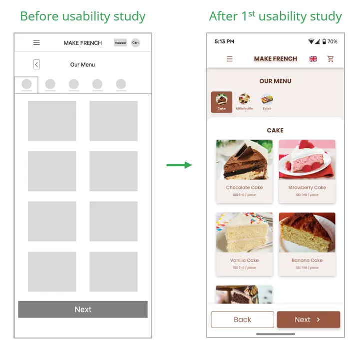
Most users are not familiar with clickable images. Therefore, I added more accessible details about clickable images and categories.
REFINED MOCKUPS
After that, I did the 2nd usability study to test main user flow including visual design, interaction & motion design, and found that it can be used smoothly. But there are a few problems that need to be solved with 2 main issues: 1. The “Start Order” button was not outstanding, it’s hard to find. 2. To order Deliver, only have to select the restaurant’s location to order from but didn’t have to choose user’s location.
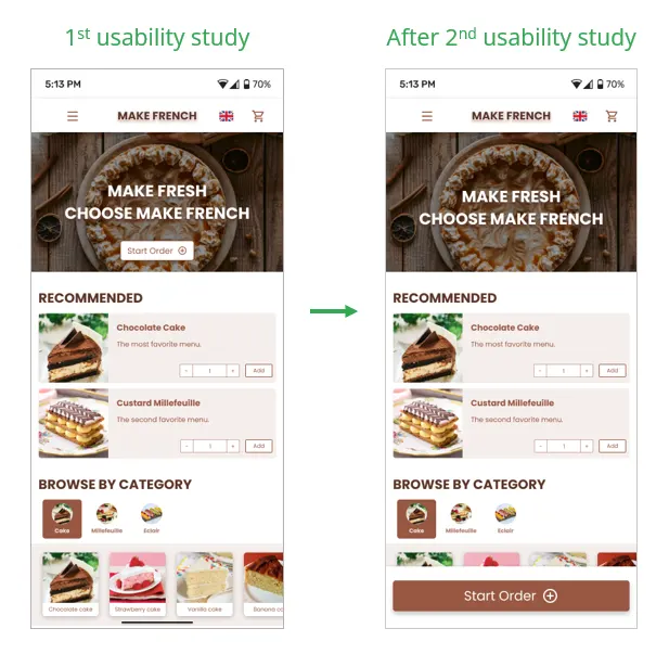
CTA button was not outstanding, so I redesigned by placing it in the bottom navigation to make it more easier to find it and start order.

For delivery order, I added more option to delivery to user’s location.
UI KIT
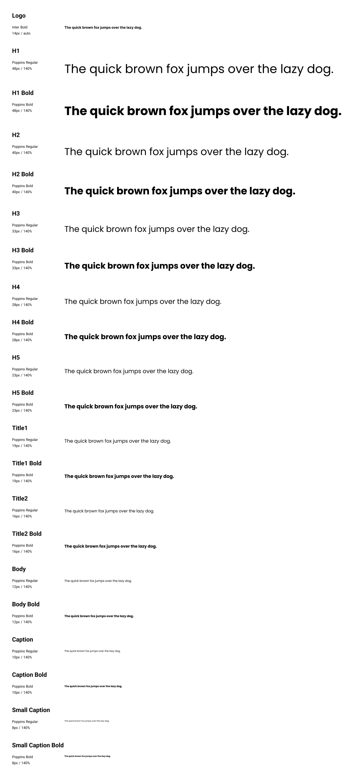
To keep consistency throughout all my designs, I created typography, color styles and components for high-fidelity prototype.


ACCESSIBILITY CONSIDERATION
I have ensured that all the color styles for each component pass the WCAG Contrast checker.
I used related icons in the navigation menu and buttons to make navigation easier.
I have considered about animations and motions for each interaction that pass the accessibility.
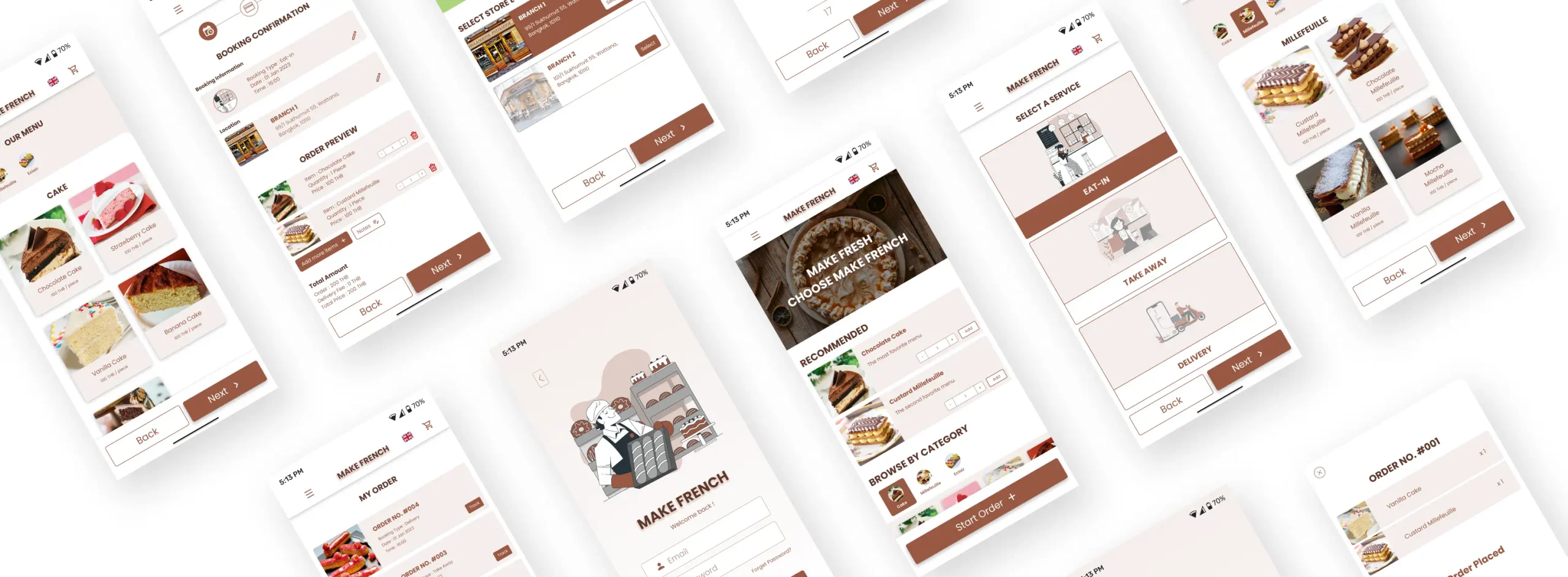
FINAL PROTOTYPE
TAKEAWAYS & NEXT STEPS
Impact:
This app will provide easier solution to book and order foods and drinks from French Patisserie store. Here are some feedback after usability tested :
“I think this app is easy to navigate to order.”
“I think that I would use this app frequently.”
“I felt confident using the app.”
This app will provide easier solution to book and order foods and drinks from French Patisserie store. Here are some feedback after usability tested :
“I think this app is easy to navigate to order.”
“I think that I would use this app frequently.”
“I felt confident using the app.”
What I learned:
I learned that how to find really insights of the users by using user research tools.
To refine the design, usability studies and feedbacks are necessary to do to improve the design for really users need in the better way. This is the most challenging thing for me.
I learned that how to find really insights of the users by using user research tools.
To refine the design, usability studies and feedbacks are necessary to do to improve the design for really users need in the better way. This is the most challenging thing for me.
Next Steps
Conduct another round of usability studies to validate whether the pain points users experienced have been effectively addressed.
Conduct more user research to determine any new areas of need like booking deposit or payment information.